
Color Trends for Home Painting in 2023
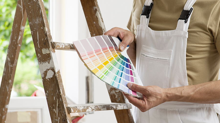
Your home’s color scheme significantly impacts its overall aesthetic appeal and can even influence your mood and comfort. Staying abreast of the latest color trends ensures that your home remains contemporary and stylish. Here is BestPaintingEstimates.com’s comprehensive guide on the latest home painting color trends for 2023:
Soft Neutrals
Earthy Tones: Expect more homeowners to gravitate towards warm, comforting earth tones like terra cotta, taupe, and rich browns. These colors evoke a sense of naturalness and tranquility, perfect for those looking to bring a touch of nature into their homes.
Soft Greys: Despite new color trends, soft greys continue to be a classic choice for many homeowners due to their versatility. They serve as an excellent backdrop for bold colors in furniture or art.
Off-Whites: Clean, but less sterile than pure white, off-whites like ivory and cream are making a big comeback. They provide a neutral backdrop and can open up and brighten any room.

Bold Accents
Deep Blues: Navy blue, teal, and sapphire create bold accents and focal points within a room. These colors work well for accent walls or for small spaces like bathrooms.
Emerald Green: This intense hue gives a room a deep sense of sophistication and luxury. It pairs excellently with gold accessories and light-colored wood.
Saturated Yellows: Cheerful and warm, saturated yellows can help in creating a sunny, uplifting atmosphere. These colors are great for kitchens or dining areas.
Natural Inspirations
Greens: In addition to emerald, other green shades reminiscent of lush forests and rich foliage are trending. These shades range from deep forest green to lighter sage hues.
Sky Blues: Light sky blue hues bring a calm, serene feel to any room. These colors work particularly well in bedrooms and bathrooms.
Botanical Prints: While technically not a color, botanical prints are popping up in more interior designs. Consider using these as inspiration for your color palette.
Retro and Vintage
Mustard and Gold: These retro-inspired hues are back in style. These colors work particularly well in a mid-century modern design aesthetic.
Dusty Pink: This soft, muted shade brings a touch of vintage charm. It pairs well with other soft colors and natural textures.
Metallics
Warm Metallics: Metallic colors like copper, bronze, and gold continue to trend, adding a touch of sophistication and glamour to any room.
Monochrome and Duotones
Monochrome Palette: A monochrome palette creates a cohesive and modern look. Consider using varying shades of the same color to create depth and interest.
Duotones: Using two contrasting yet complementary colors can make a bold statement. This style is particularly effective when one color is neutral, and the other is more vibrant.
New Neutrals
Mushroom: A unique blend of grey, beige, and taupe, Mushroom is an emerging trend for a reason. Its versatility means it can work well in a variety of settings.
Greige: As the name suggests, this is a blend of grey and beige. Greige is a beautiful neutral that can lean warm or cool, depending on the shades it’s paired with.

Cool Tones
Powder Blues: Soft, airy powder blue creates a soothing and tranquil atmosphere. It’s ideal for spaces where you want to relax and unwind, like bedrooms and bathrooms.
Lavender: This cool, light shade of purple is both calming and uplifting. Lavender is an excellent choice for spaces meant for relaxation and creativity.
Multicultural Influences
Mediterranean Blues: Vibrant and warm, the blues seen in Mediterranean cities are making their way into more homes. Think about the rich, turquoise seas, or the famous Santorini blue.
Moroccan Reds and Oranges: Warm, vibrant, and energetic, these colors can make a statement and work particularly well in dining or living rooms.
Eco-conscious
Eco-Green: As sustainability continues to be a significant influence in our lives, colors that remind us of nature and our planet are becoming more popular. Eco-green is a soft, mid-tone green that can make any room feel more organic and grounded.
Ocean Blue: This deep, rich color is reminiscent of the ocean’s depths and helps bring a sense of calm and tranquility to a room. It’s perfect for creating a relaxing space.
Remember, while these are the latest trends, the best color choice for your home is ultimately a personal decision that reflects your taste and lifestyle. Also, consider factors like room size, natural light, furniture color, and your home’s overall design theme. Regardless of your decision, at BestPaintingEstimates.com, we’re here to help you bring your vision to life with expert painting services and advice.
Paint Colors that Match Your Home Style
Painting your home can significantly transform its overall look and feel. However, it’s essential to choose colors that not only align with your personal tastes but also complement your home’s architectural style. Here’s how you can match your paint choices to various home styles:
1. Victorian Style
Victorian homes are characterized by detailed, ornate designs and multi-faceted color schemes. These houses typically feature three to six colors to accentuate the intricate details and trim work. Rich, royal colors like deep blues, purples, and reds work well here, accented with creams and gold tones.
2. Modern/Contemporary Style
Modern homes favor a more minimalist approach with a focus on clean lines and simplicity. Opt for a monochromatic or duotone color scheme. Shades of white, grey, and black are popular choices. If you want a pop of color, choose one bold, dramatic color and use it sparingly for a modern, stylish look.
3. Craftsman Style
Craftsman homes, known for their natural materials and heavy trim, work well with earthy, warm tones that highlight these details. Think rich browns, deep greens, and warm golds. A crisp white or cream can help emphasize the woodwork and trim.
4. Colonial Style
Colonial homes traditionally use a more conservative and straightforward color scheme. Whites, creams, light greys, and blues are common choices. However, to make the shutters and doors stand out, consider using deep, bold colors such as navy blue or forest green.

5. Mediterranean Style
Mediterranean-style homes are often seen with warm, earthy tones that reflect the seaside landscapes of the region. Opt for terracotta, beige, and shades of blue. Bright, sun-washed colors can also work well as accents.
6. Mid-Century Modern Style
This style, prominent in the ’50s and ’60s, calls for bold, contrasting colors. Think mustard yellow, avocado green, and tangerine paired with neutrals like taupe and cream. A monochromatic scheme with pops of these bold colors can make your home truly stand out.
7. Farmhouse Style
Farmhouse-style homes look best with a fresh, simple color palette. Whites and light greys are the go-to options. However, feel free to experiment with muted pastels and earthy tones as accents, especially on the doors, shutters, or trim.
8. Coastal Style
Coastal-style homes should reflect the colors of the beach and sea. Soft blues, greens, and sandy beige or white are excellent choices. These colors can be used in a gradient to reflect the transition from sand to sea.
While these are general guidelines, remember that your home is a reflection of your unique style and taste. There are no hard and fast rules. A professional painting service can help bring your vision to life while ensuring your home maintains its architectural integrity.